

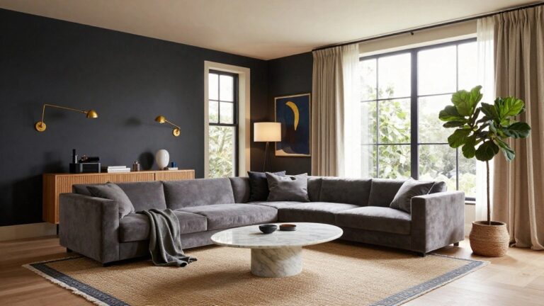
I’ve spent enough time rearranging my own living room to know that a strong color palette makes the space feel alive without cluttering the daily flow of family life.
People tend to notice the walls and how they frame the furniture first, deciding in seconds if the room pulls you in or pushes you away.
I once layered warm golds over cool grays in ours, and it shifted the whole feel from stark to welcoming under our afternoon light.
That balance keeps luxury grounded in real use.
Some palettes in here strike me as worth sketching onto your floor plan for a quick test before committing.
Charcoal Gray Walls for Cozy Depth
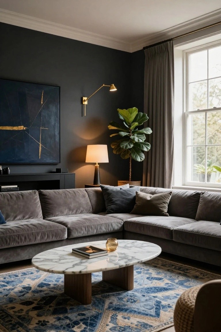
Deep charcoal gray walls set the tone here. They make the room feel intimate without closing in, especially with that soft gray velvet sofa soaking up the shade. A few gold accents on lamps and art keep it from going flat, and the blue rug underneath adds just enough pattern to pull your eye around.
Try this in a living room with tall windows that let in light during the day. It suits older homes with high ceilings, or any space you want to feel more pulled together. Skip it if your room is small and dim… stick to lighter grays instead.
Deep Green Velvet with Tan Leather Tones
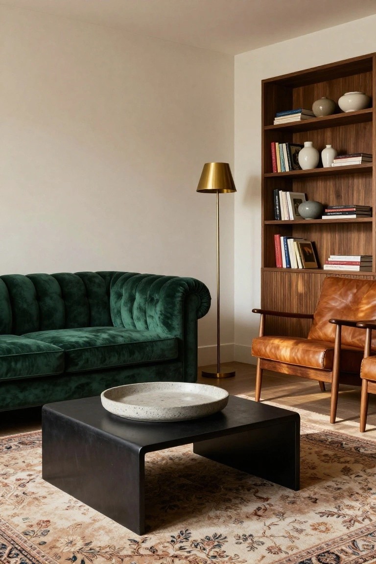
A deep emerald green velvet sofa takes center stage here. It brings a rich pop of color that feels fresh and a bit daring. Tan leather chairs nearby add warmth, while wood shelves and a black table keep things grounded. White walls let the green shine without competing.
This palette suits a cozy living room in a traditional home. Use it where you want some luxury but nothing too flashy. Stick to neutral walls and floors so the green and tan stand out. Just make sure the room gets decent light… dark corners can mute the effect.
Coastal Blues with Natural Wood
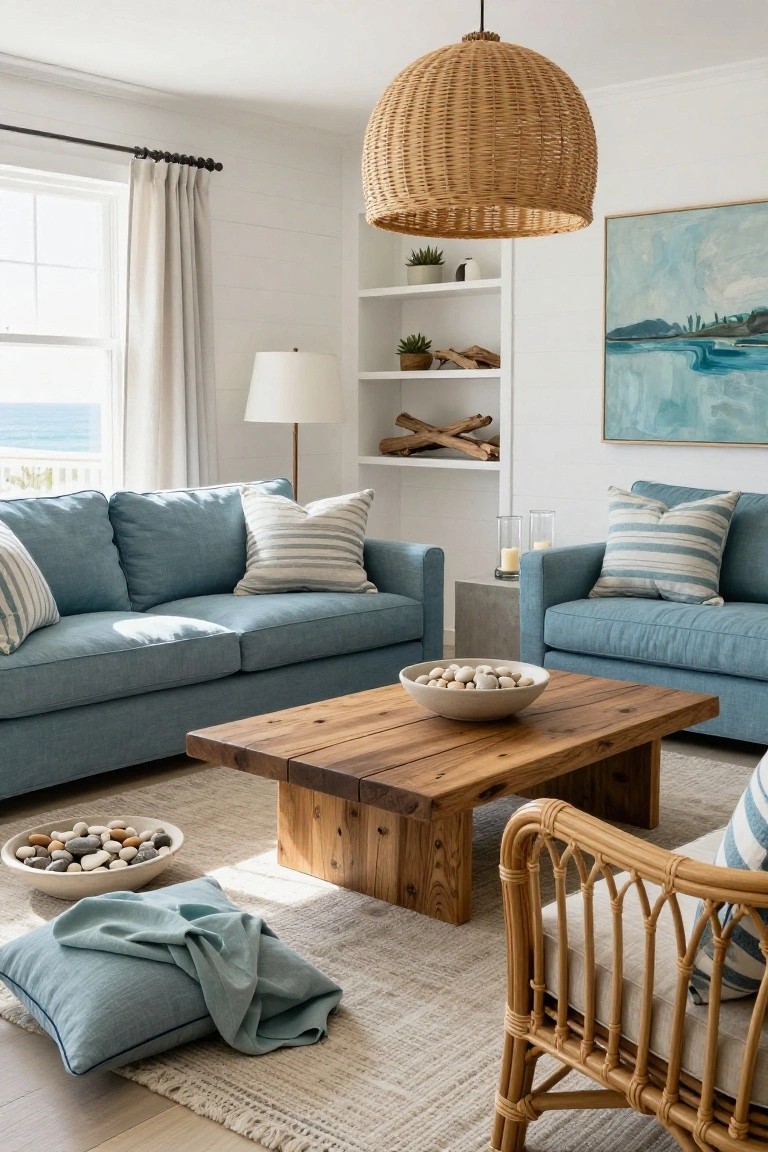
This setup takes soft blue sofas and layers in natural wood tones for a calm coastal look. The blue on the furniture picks up ocean views through big windows, while a rough wood coffee table and rattan chair add warmth that keeps things from feeling cold. White shiplap walls let the colors breathe… simple and easy on the eyes.
Try it in sunny living rooms where you want relaxed vibes. It suits vacation homes or city spots craving a beach escape. Stick to muted blues on bigger pieces, wood on tables and chairs, and keep accessories minimal like pebbles in bowls. Works best with good light.
Blush Pink Sofas in a Neutral Room
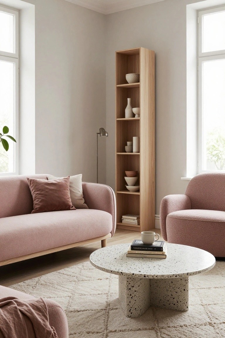
Blush pink sofas like the curved ones here bring a gentle warmth to a living room. Against pale greige walls, the color feels fresh and not overpowering. It works because the pink picks up light from the windows, making the space feel bigger and more open.
You can pull this off in homes with lots of natural light. Add oak shelves and simple white ceramics to balance things out. Skip it in dark rooms, though… the pink might look dull there.
Navy Blue Velvet with Gold Accents
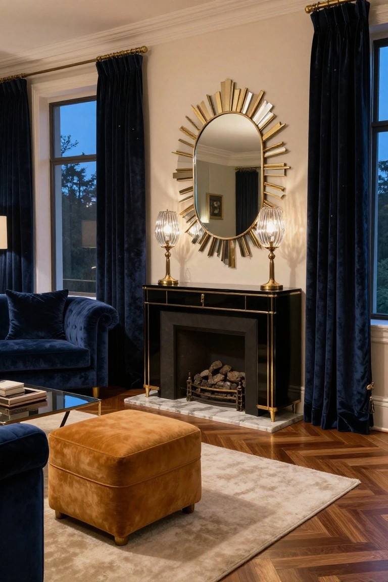
Deep navy shows up strong here on the sofa and those heavy curtains. Paired with gold on the big sunburst mirror and brass lamps, it gives the room a real jewel-box feel without going overboard. The black fireplace with gold trim ties it right in, and that warm wood floor keeps things from getting too dark.
You can pull this off in a formal living room or even a family space if you want some polish. Stick to velvet or similar fabrics for the navy pieces, then layer in gold lamps or frames. Throw in one warmer piece like that orange ottoman… it breaks up the blue nicely. Best for homes with good natural light.
Black and White Living Rooms with Red Accents
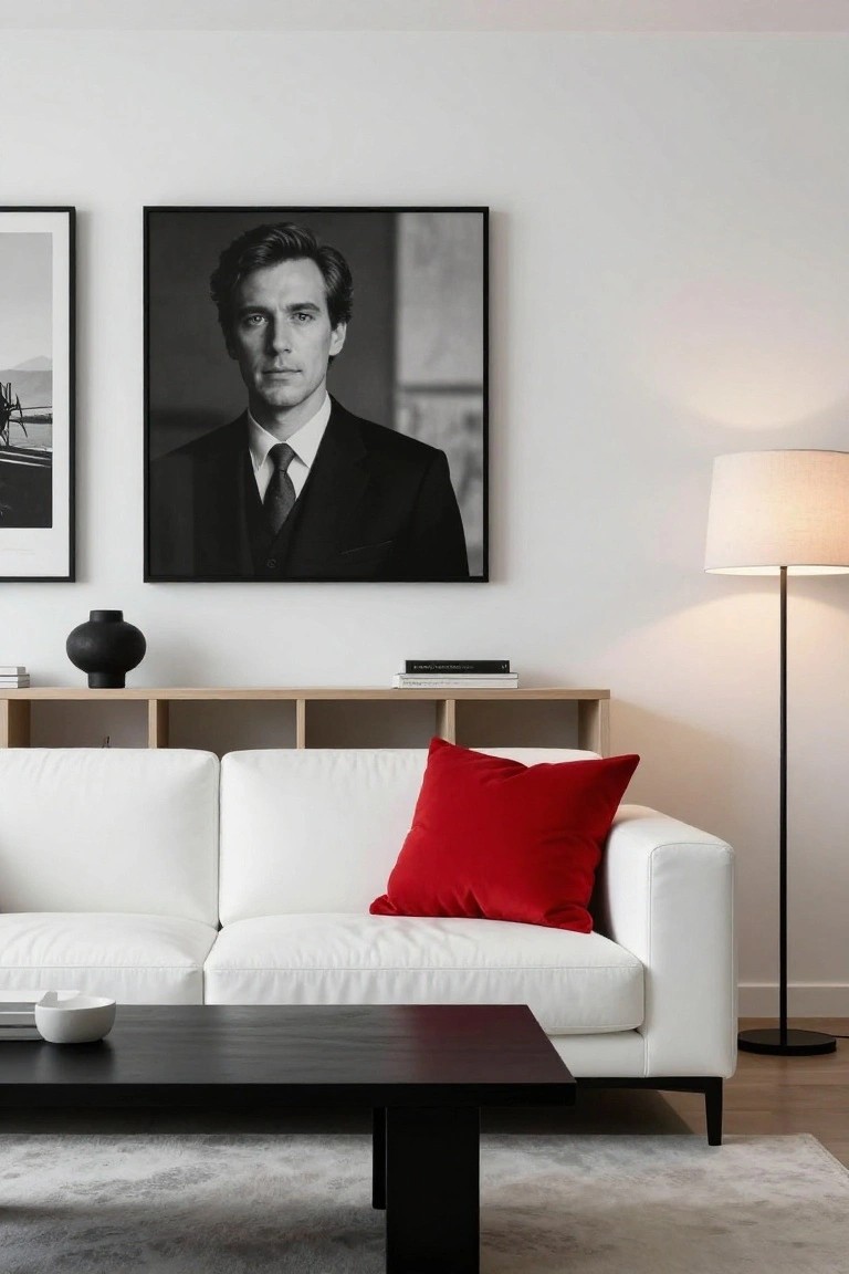
Black and white setups like this one keep things clean and sharp. A white sofa sits against light walls, with black frames, a dark table, and wood shelves adding contrast. Then that single red pillow pulls it all together. It gives a fresh hit of color without messing up the simple look.
You can pull this off in most living rooms, especially smaller ones where you want focus. Stick the red on seating or a chair, and keep the rest neutral. Pairs well with modern furniture… or even midcentury stuff if you swap the frames for warmer wood. Just don’t overdo the red, or it fights the calm.
Warm Neutrals with Leather and Wood
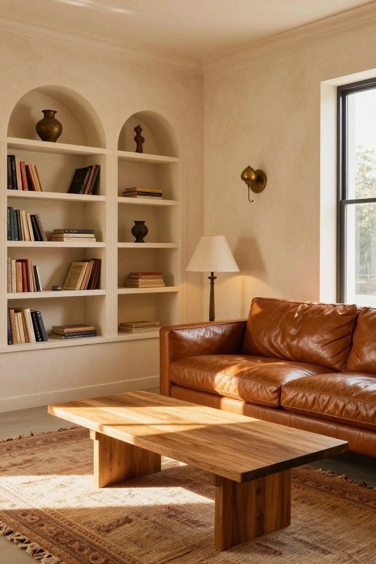
This setup leans on soft beige walls and shelves mixed with tan leather on the sofa and natural wood on the low coffee table. The tones pull from earth colors that blend right in, giving the room a steady, comfortable feel. No bold clashes here. Just quiet layers that make the space easy to settle into.
Try it in living rooms that get good light during the day. Pair real leather or suede seating with wooden pieces in similar shades. Throw in a rug with faded patterns for some interest. Works well in older homes or apartments aiming for that lived-with look… watch the scale so the sofa doesn’t overwhelm.
Olive Green Sofas in a Neutral Living Room
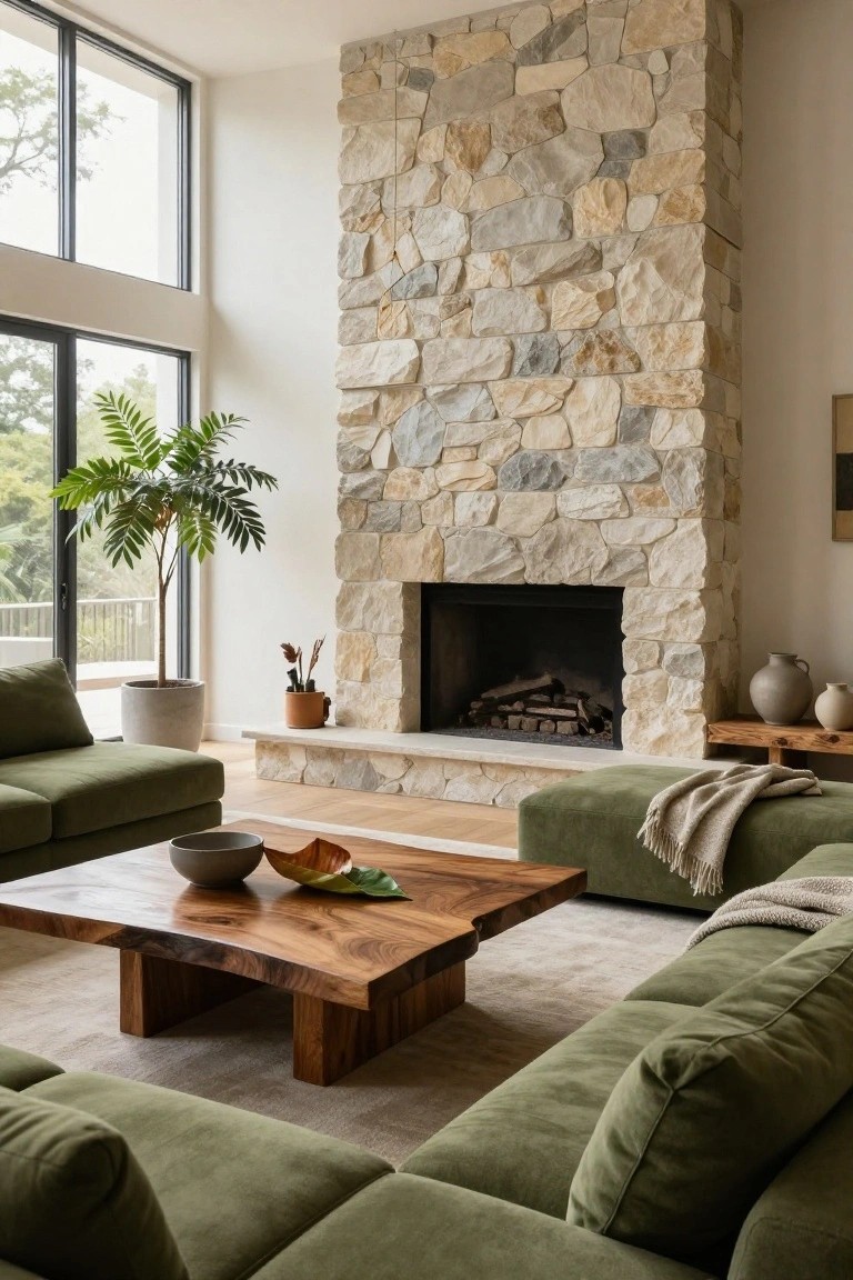
Olive green sofas like these bring a bit of nature inside without overwhelming the space. They sit nicely against white walls and light oak floors, while the tall stone fireplace adds some texture and warmth. That wood coffee table with its live edge keeps things feeling organic and ties right into the green tones.
This palette works best in rooms with big windows and lots of natural light. It suits modern homes or ones with a rustic edge… just keep the rest mostly neutral so the green doesn’t compete. Avoid darker floors here, they might make it too heavy.
Cool Grays with Metallic Touches
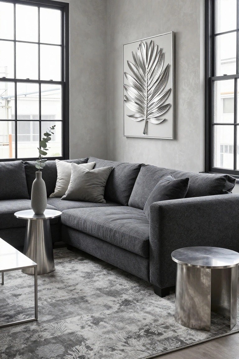
Gray shows up everywhere in this living room. The walls are a soft plaster shade, the sofa is charcoal textured fabric, and even the rug has gray patterns. What makes it pop are the metallic pieces. Brushed silver tables and a big silver leaf wall hanging catch the light just right. It keeps things calm but adds that little bit of shine people notice.
This setup works great in apartments or open-plan homes where you want modern without too much fuss. Stick to one gray family, then pick two or three metal spots like tables or art. Good window light helps the metals stand out. Skip busy patterns elsewhere, or it gets muddy.
Powder Blue Tufted Sofa
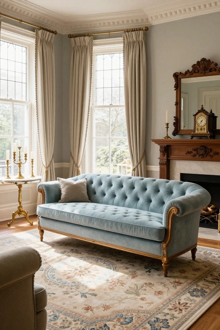
A powder blue tufted sofa like this one adds a gentle pop of color to a mostly neutral living room. Light gray walls and creamy curtains keep things calm around it. The velvet picks up sunlight from the windows, while wood on the fireplace brings some warmth.
This setup fits homes with traditional details or big light-filled rooms. Place the sofa near a mantel or windows for balance. Go with pale neutrals and gold touches nearby. Steer clear of bold patterns on the floor… they can muddle the blue.
Teal and Pink Living Room Palette
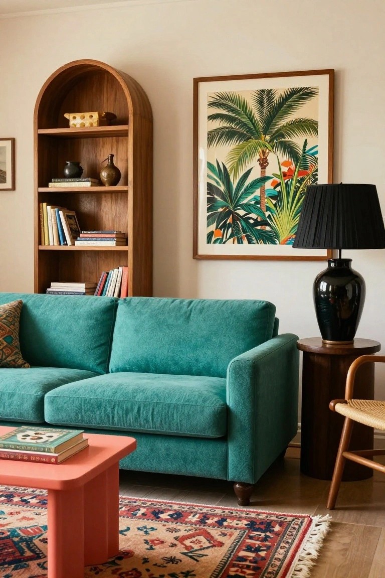
A deep teal sofa takes center stage here. It pairs with a hot pink coffee table and a multicolored rug for real pop. Warm wood shelves and a tropical print on the wall add some balance without toning things down too much.
This kind of palette works best in sunny rooms where the colors can shine. Use it in casual family spaces or apartments with plain walls. Stick to just a couple bold pieces so the rest stays neutral… or it might feel busy.
Lavender Walls Warm Up a Neutral Living Room
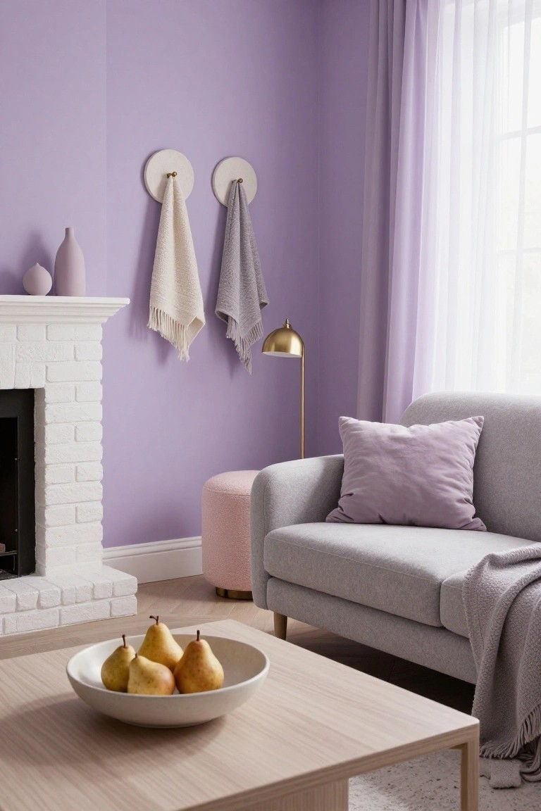
A soft lavender paint on the walls gives this living room a gentle, restful feel without overwhelming the space. It plays well off the white brick fireplace and keeps the gray sofa from feeling too stark. Those hanging towels in cream and gray add a cozy, lived-in touch that ties right into the palette.
This color works best in rooms with decent light, where it can glow a bit in the afternoon. Go for matte finishes to avoid glare, and layer in wood furniture plus a few pinks or yellows for interest. It’s great for apartments or homes that need a fresh update but not a big overhaul.
Black Walls with Gold and Emerald Accents
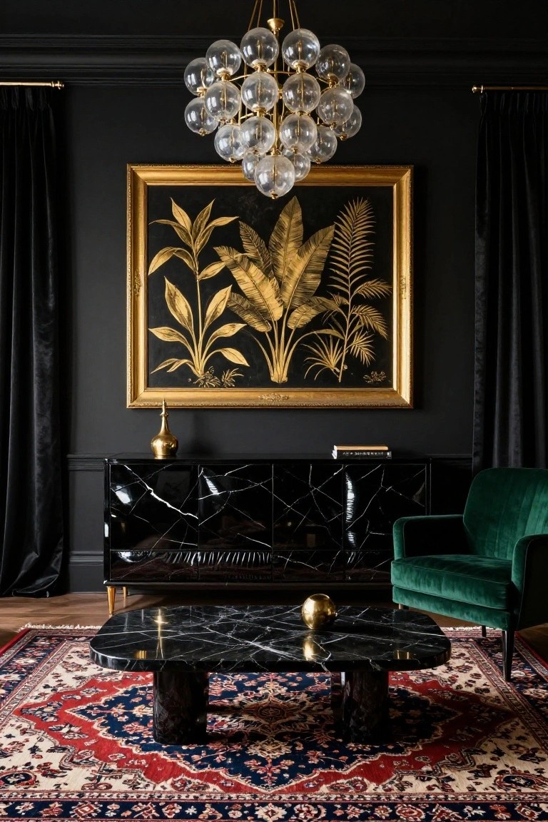
Black walls set a moody stage in this living room. Gold shows up in the big leaf painting and brass items like the vase and orb. Then that emerald green chair pulls in a bit of color without overwhelming things. It’s a simple way to make a space feel rich and put-together.
You can pull this off in a room with decent overhead light, maybe from a chandelier like the one here. It suits city apartments or older homes wanting some drama. Stick to black paint that’s not too flat, and add textures on furniture so it stays cozy. One green piece is plenty… don’t overdo it.
Warm Earthy Neutrals for Cozy Living Rooms
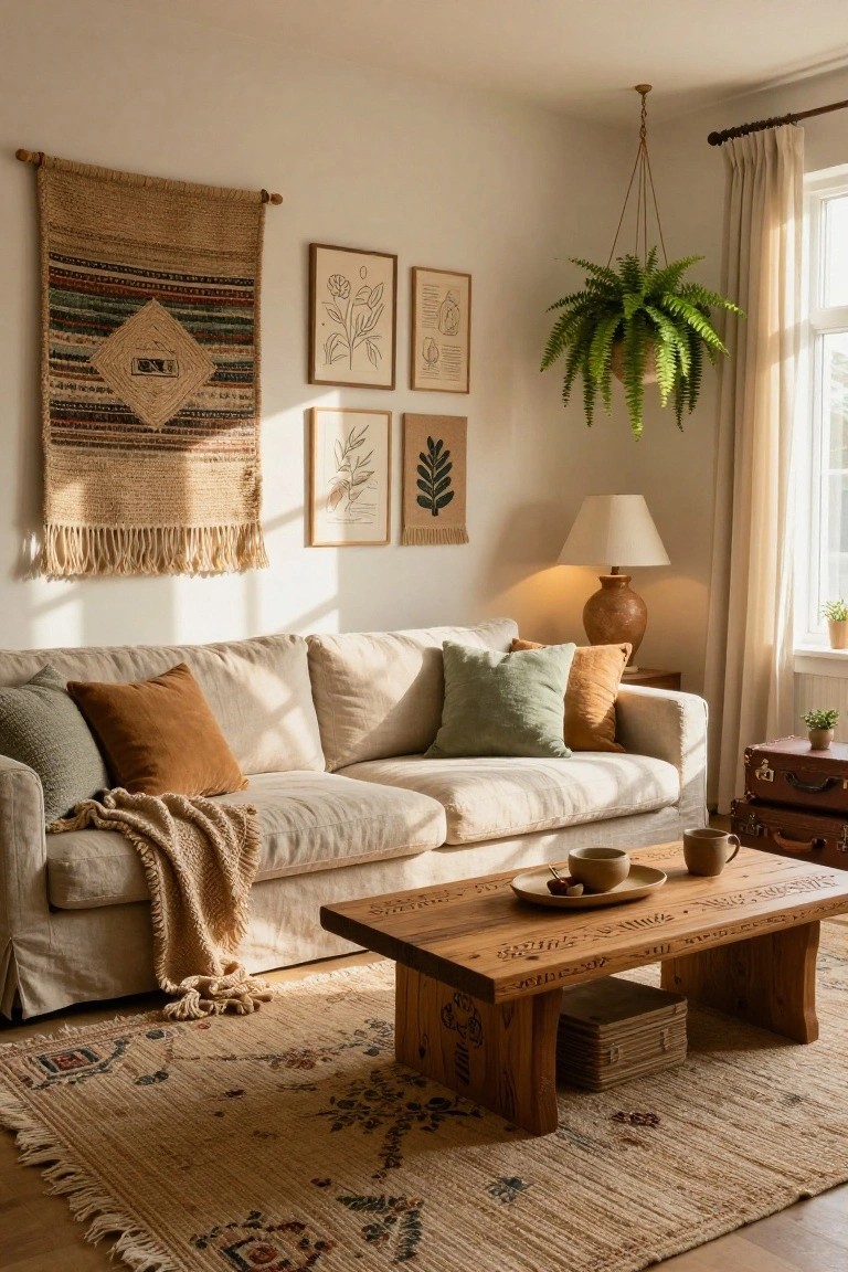
A simple mix of cream walls, beige linen sofas, and touches of rust and sage green keeps things calm and lived-in. The carved wooden coffee table adds that bit of texture without overwhelming. Folks like this look because it feels warm year-round. No cold grays here.
Use it in family rooms or apartments with good light. Start with neutral basics then layer in wood tones and a few plants. It suits older homes too. Just don’t overload on patterns… or it gets busy.
Sage Green Walls with Warm Wood Tones
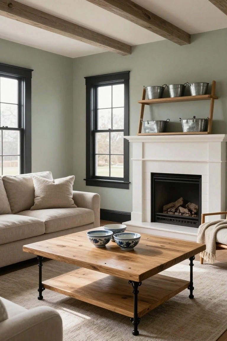
Sage green walls bring a soft, restful feel to this living room. They pair nicely with the natural wood on the coffee table, which has that rugged, reclaimed look. The white fireplace keeps things crisp, while black window frames add some edge without overpowering.
You can pull this off in spaces with lots of natural light, like rooms with big windows. Stick to light neutrals on the sofa and rug to let the green and wood stand out. It’s great for traditional homes wanting a fresh update… just avoid too much dark furniture or it might feel closed in.
Terracotta Walls with Blue Tile Accents
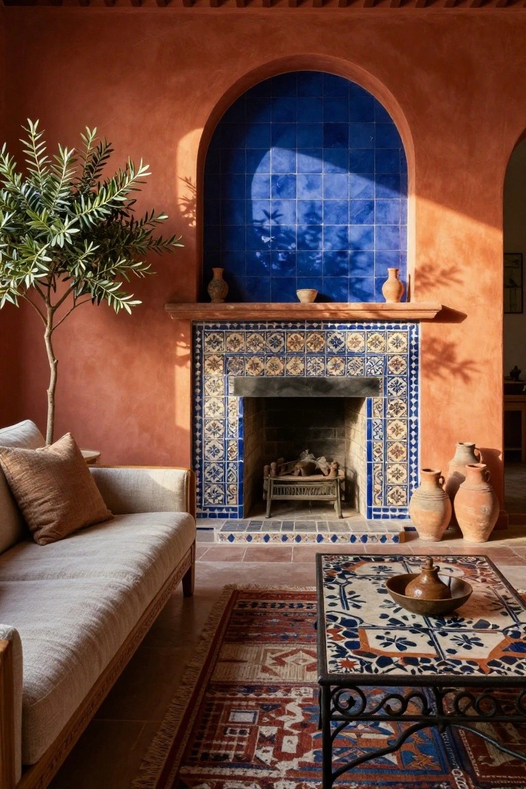
Warm terracotta walls give this living room a cozy, sun-baked feel right away. The orange plaster pulls in natural light and makes the space feel bigger and more alive. Then the blue tiles around the fireplace arch jump out, adding that crisp contrast without overwhelming things. An olive tree in the corner ties it all to a relaxed, almost Mediterranean vibe.
You can pull this off in rooms with good sunlight, where the orange won’t feel too heavy. Pair it with neutral furniture like a simple linen sofa and woven rugs to keep balance. It works great in open-plan homes or spaces that need some personality. Just watch the tile scale. Too much blue might compete, so keep it focused around a focal point like the mantel.
Blue Concrete Floors with Leather Sofas
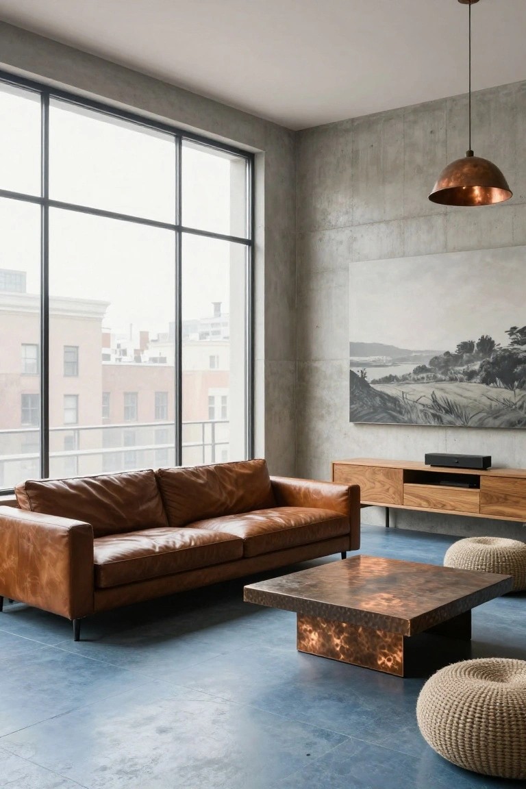
A blue concrete floor like this one gives a living room a solid, cool foundation. It lets the tan leather sofa stand out right away, and that copper coffee table picks up a warm shine against it. The mix feels fresh but grounded, especially with concrete walls keeping things simple.
This setup works best in open urban spaces or lofts with lots of natural light from big windows. Pair the blue floor with leather or wood furniture to warm it up, but stick to low pieces so the floor stays the focus. Just watch that the blue doesn’t feel too cold… add a rug if needed for softer spots.
Beige Neutrals for Calm Living Rooms
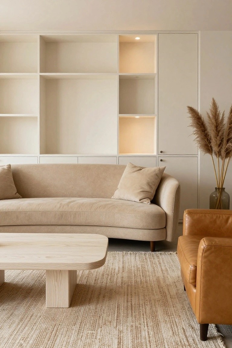
A simple palette of beiges and off-whites keeps this living room feeling open and restful. The fabric sofa in a soft beige tone matches the walls and shelves nicely, letting the space breathe without much fuss. That oak coffee table brings in just enough warmth to make it cozy.
This setup works well in apartments or family homes where you want low-key luxury. Stick to layered neutrals like cream cushions and a light rug, then add one wood piece and some dried grass for interest. It suits smaller rooms too, but mix textures so it doesn’t go flat.
Teal Velvet with Warm Wood Tones
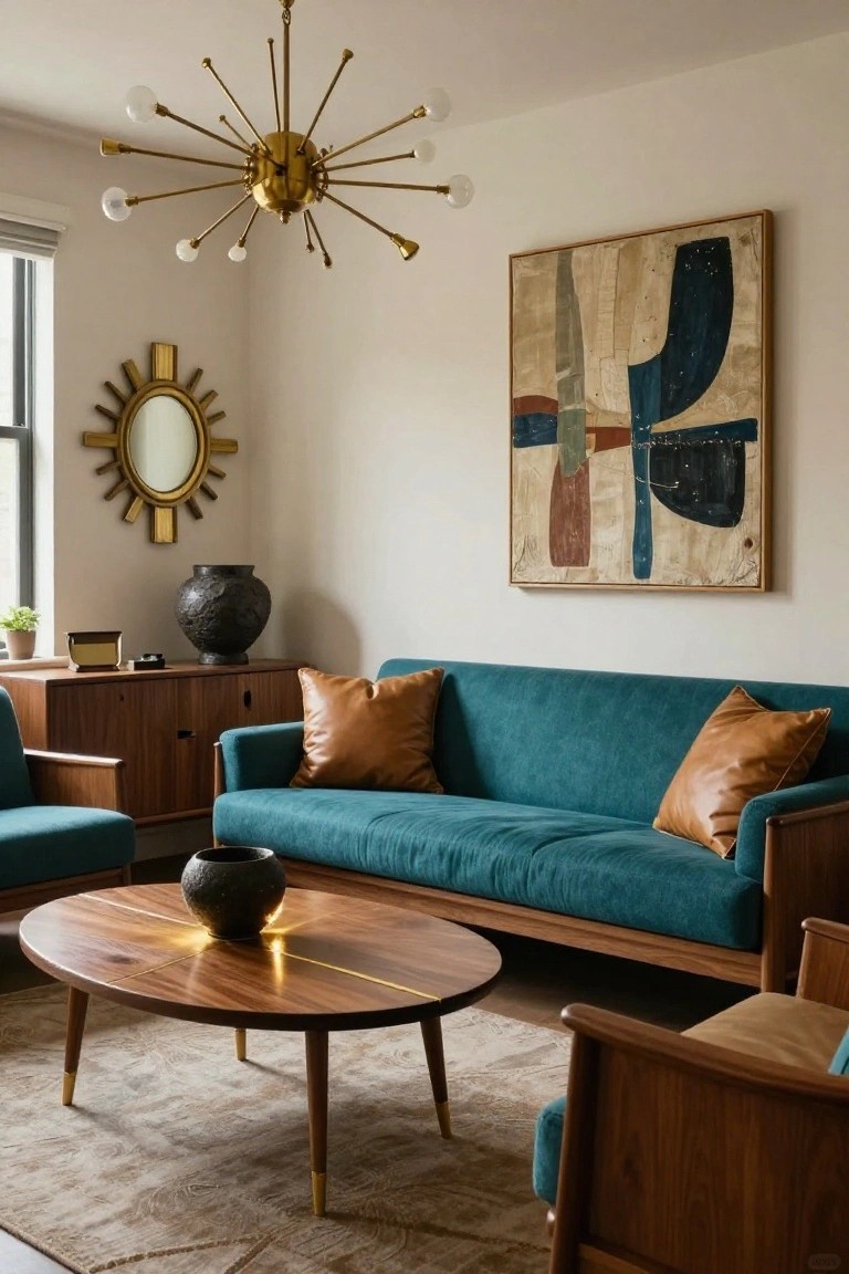
A teal velvet sofa takes center stage here, surrounded by walnut wood pieces like the coffee table and chairs. That rich teal color pops right against the warm brown wood and soft leather pillows, while creamy walls keep everything from feeling too heavy. Gold accents in the chandelier and mirror add just enough shine without overdoing it.
This mix works well in living rooms that get good natural light. It suits midcentury style homes or spaces where you want cozy luxury without bright whites everywhere. Stick to one big teal piece, then layer in woods and neutrals. Watch the scale though. Too much teal can close in a small room.
Copper Accents in Dark Living Rooms
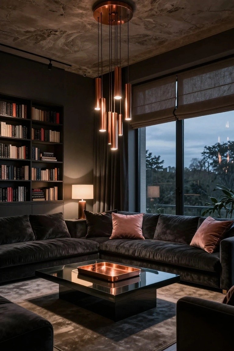
Dark walls and black velvet sofas set a moody base here. Then copper shows up in the hanging lights and a tray on the coffee table. It pulls the eye right to those warm spots. Pink pillows keep it from feeling too heavy.
This works well in rooms with plenty of windows. The copper catches evening light and glows softly. Good for city apartments or modern houses where you want a cozy luxury vibe. Just balance it so the dark doesn’t close in too much.
Neutral Base with Lush Green Accents
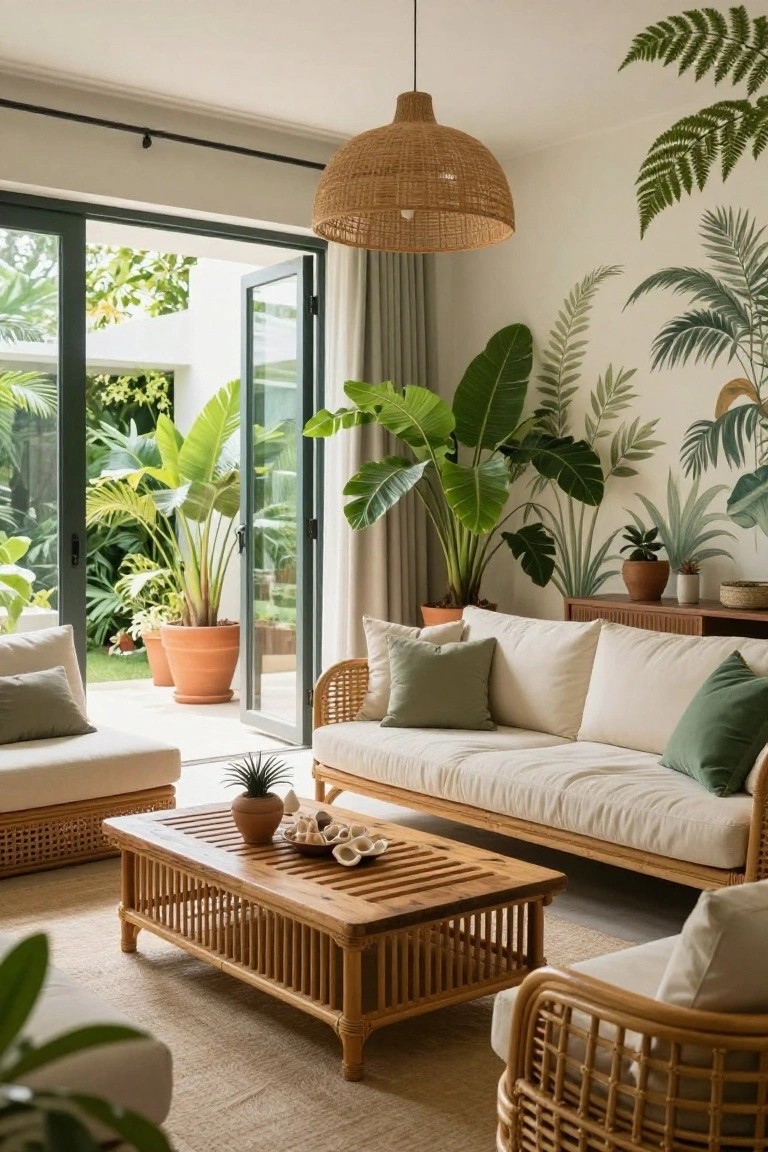
A simple way to give a living room that fresh tropical feel is starting with creamy white furniture and wood tones, then layering in plenty of green from plants and cushions. Here the big potted palms and monstera stand out against the light walls and sage pillows on the sofa. It keeps things light but alive, like you’re always near the garden.
This palette shines in rooms with good natural light, especially open-plan spaces that flow outside. Go for terracotta pots on neutral rugs and rattan pieces to tie it together. Works great in coastal or modern homes… just don’t overcrowd, or it can feel jungle-thick instead of relaxed.
Warm Mustard Sofa in Neutral Rooms
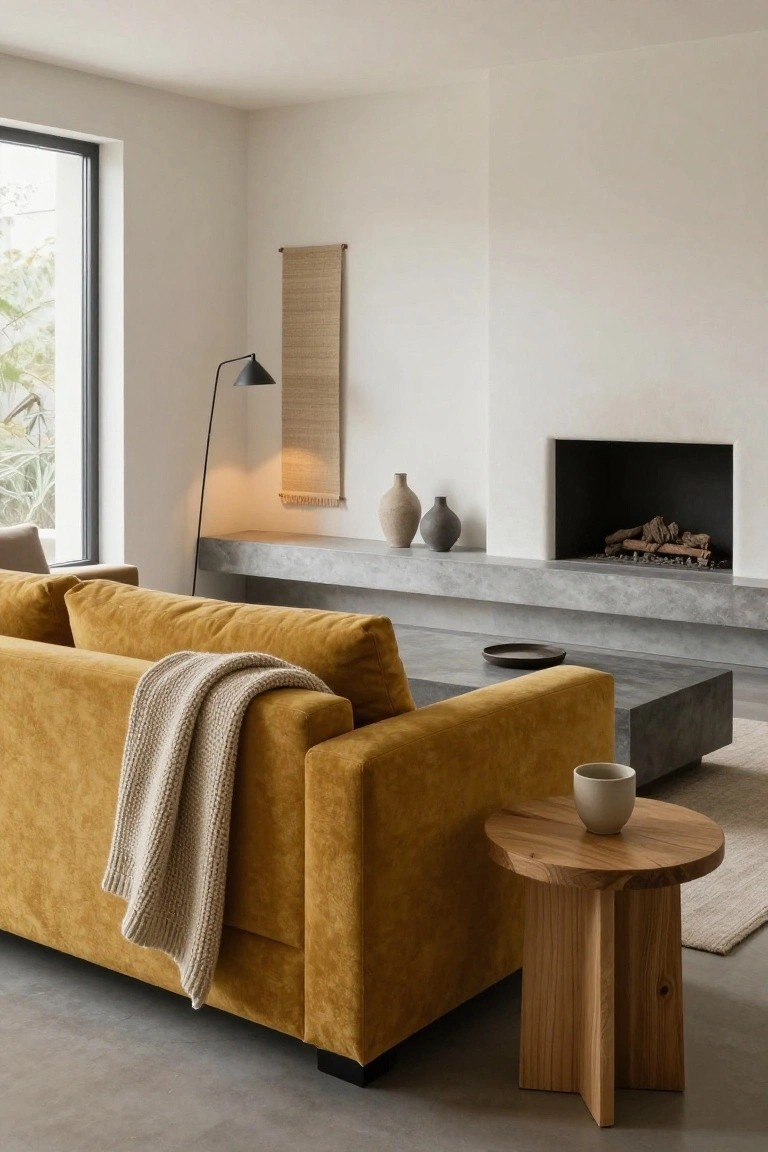
A mustard velvet sofa like this one brings a shot of warmth to a simple living room setup. White walls and gray concrete details stay quiet in the background. That bold color on the upholstery pulls your eye right away. It makes the whole space feel lived-in and inviting without much fuss.
Put this idea to work in modern or minimalist homes where you want one strong color hit. Let the sofa sit against plain walls or near a fireplace shelf. Add wood accents for balance. Skip busy patterns elsewhere so the mustard stands out. Works best in rooms with good natural light.
Frequently Asked Questions
Q: My living room faces north and stays pretty dim. Which palettes work best there?
A: Warm jewel tones like amber and rust bring life to low-light spaces. They reflect what little light you get and create that rich, luxe glow. Slap up some samples at different times of day to see the magic.
Q: I love the bold palettes but my room is small. Won’t dark colors shrink it?
A: Opt for palettes with high-contrast lights and darks, like creamy whites punched with charcoal. This tricks the eye into seeing more depth. Furniture in similar tones ties it all together smoothly.
Q: How do I test a palette before painting the whole room?
A: Grab large paint swatches or poster boards in the key colors. Pin them up and live with them for a week…move them around to catch different lights. You’ll know fast if it pops for you.
Q: My sofa is neutral but dated. Can I still rock these luxury palettes?
A: Drape new pillows and a throw in palette shades right over it. That instant update pulls everything into the vibe. Shop thrift for rugs too – they ground the colors perfectly.
